Our work
Bespoke software. Built for real businesses.
Every project here was designed and built from nothing for the business that needed it: platforms, websites, native applications and a multiplayer game. Where a client is happy to be named, we name them and link the live site. Where they are not, we describe the work and leave the name out.
- 01Bespoke business platformBringing an entire organisation together.
- 02FoundrySmarter project planning.
- 03PlacelyHelping students find opportunities.
- 04REIGNTraining without interruptions.
- 05KrosshairHigh-performance multiplayer.
- 06NotchlyReimagining an existing product.
- 07WERMBuilding trust through design.
- 08WERM field applicationDigital tools for teams in the field.
-
Bringing an entire organisation together.
- Type
- Multi-tenant SaaS platform
- Runs on
- Web, iOS and Android
The problem
An organisation running a complex operation on paper registers, a spreadsheet schedule and a group chat. Several different groups of people needed different things from the same information, and none of them could get at it without going through somebody else.
What we built
A bespoke platform bringing together the tools, information and workflows needed to manage the organisation: scheduling, attendance, capacity, billing and messaging, over one set of records. Different users have interfaces and functionality suited to their individual needs, within one connected system. Web, iOS and Android all come out of the same codebase, so there is one version to keep up to date rather than three.
How it holds up
Every record belongs to one organisation and must never reach another. That rule is enforced by the database itself rather than trusted to the app, so a tampered client gets nothing back. It is covered by 550 automated tests across 33 files, plus 121 assertions that check each permission twice: that the right person is let in, and that the wrong one is not.
Key features
- Multi-user platform
- Role-based access control
- Scheduling and booking
- Customer management
- Reporting and analytics
- Billing and invoicing
- Mobile and desktop support
Redacted: every name, photograph and figure covered
-
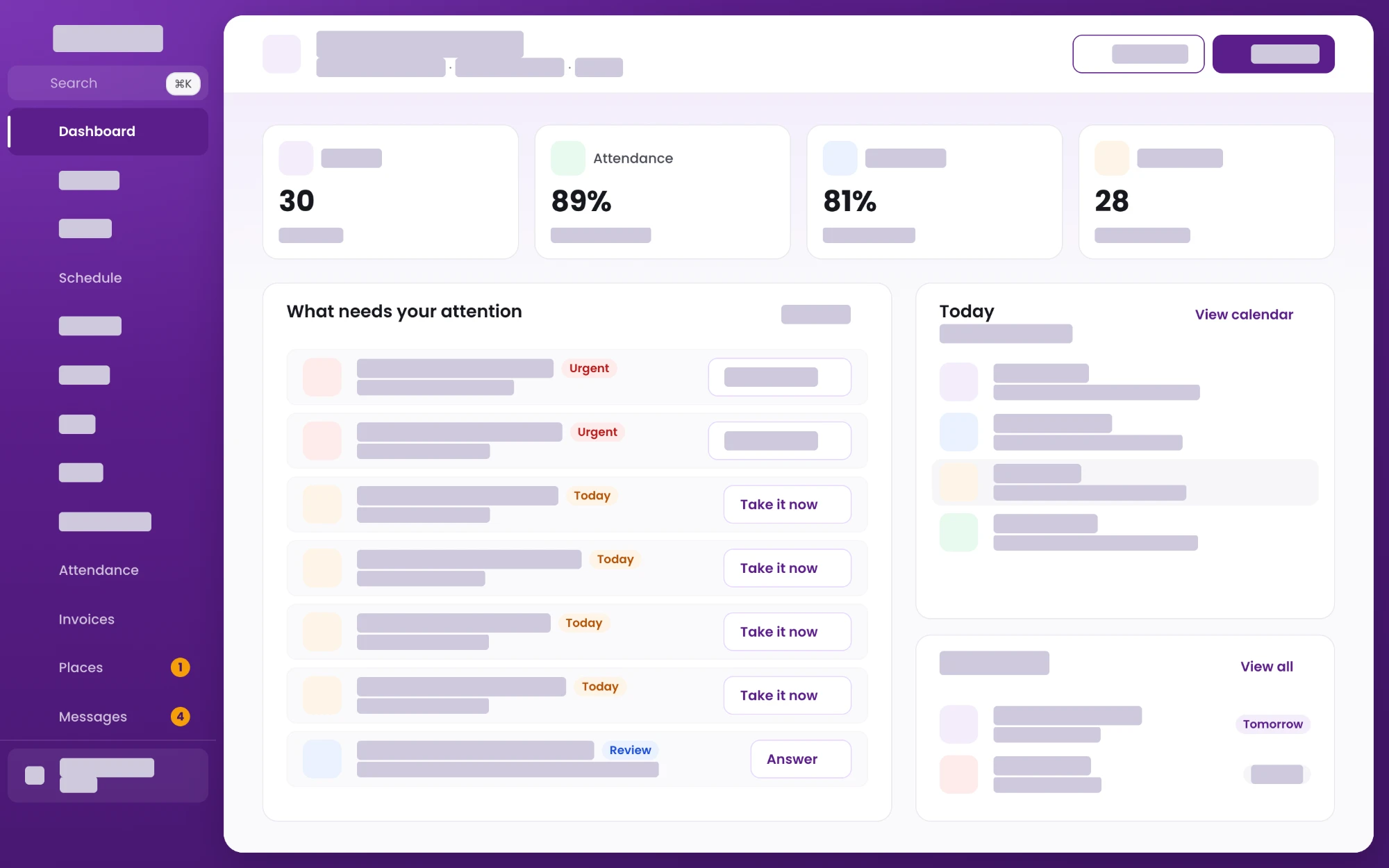
The dashboard. Not a wall of charts: a list of what actually needs doing, each row carrying the action that deals with it.
-
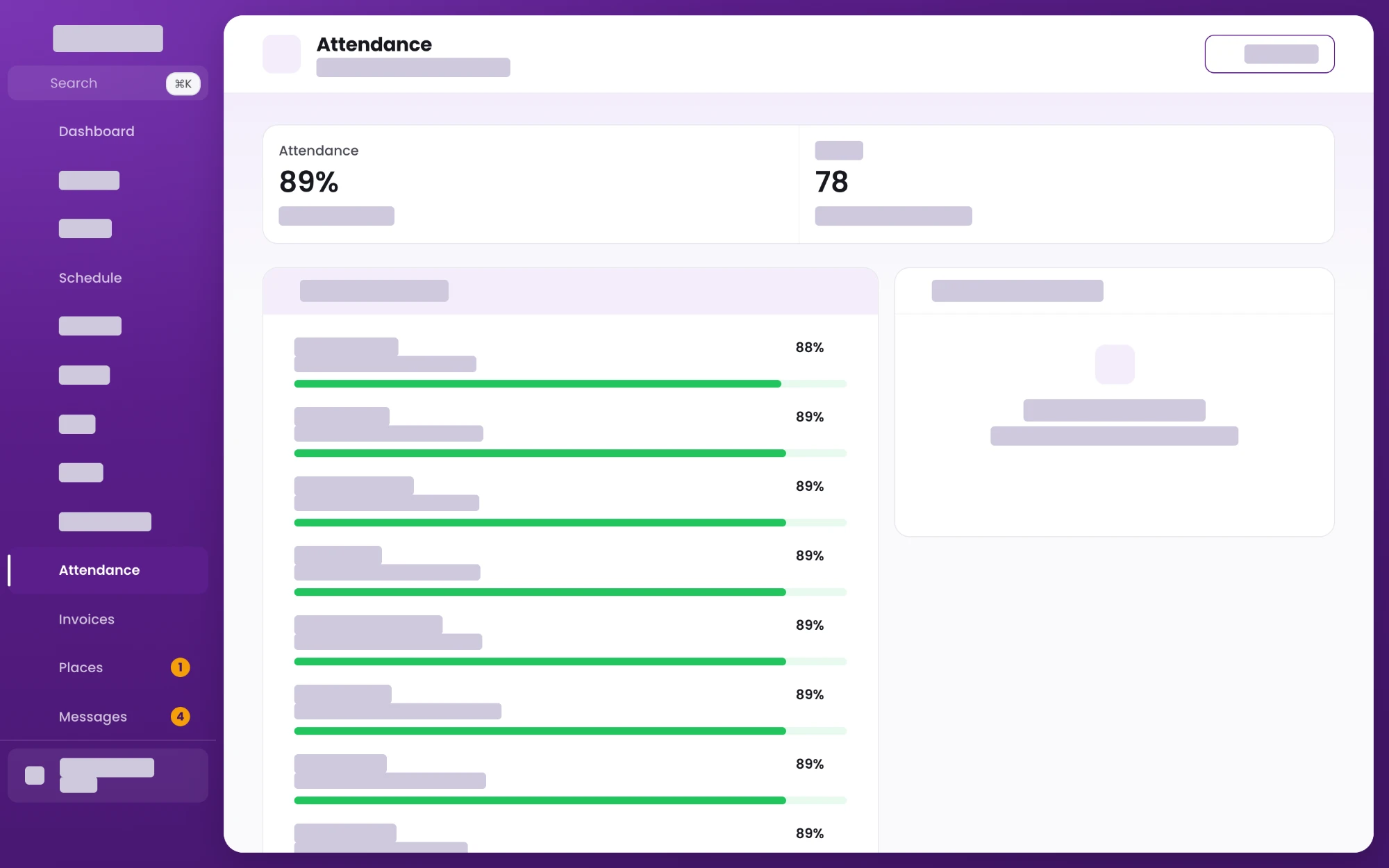
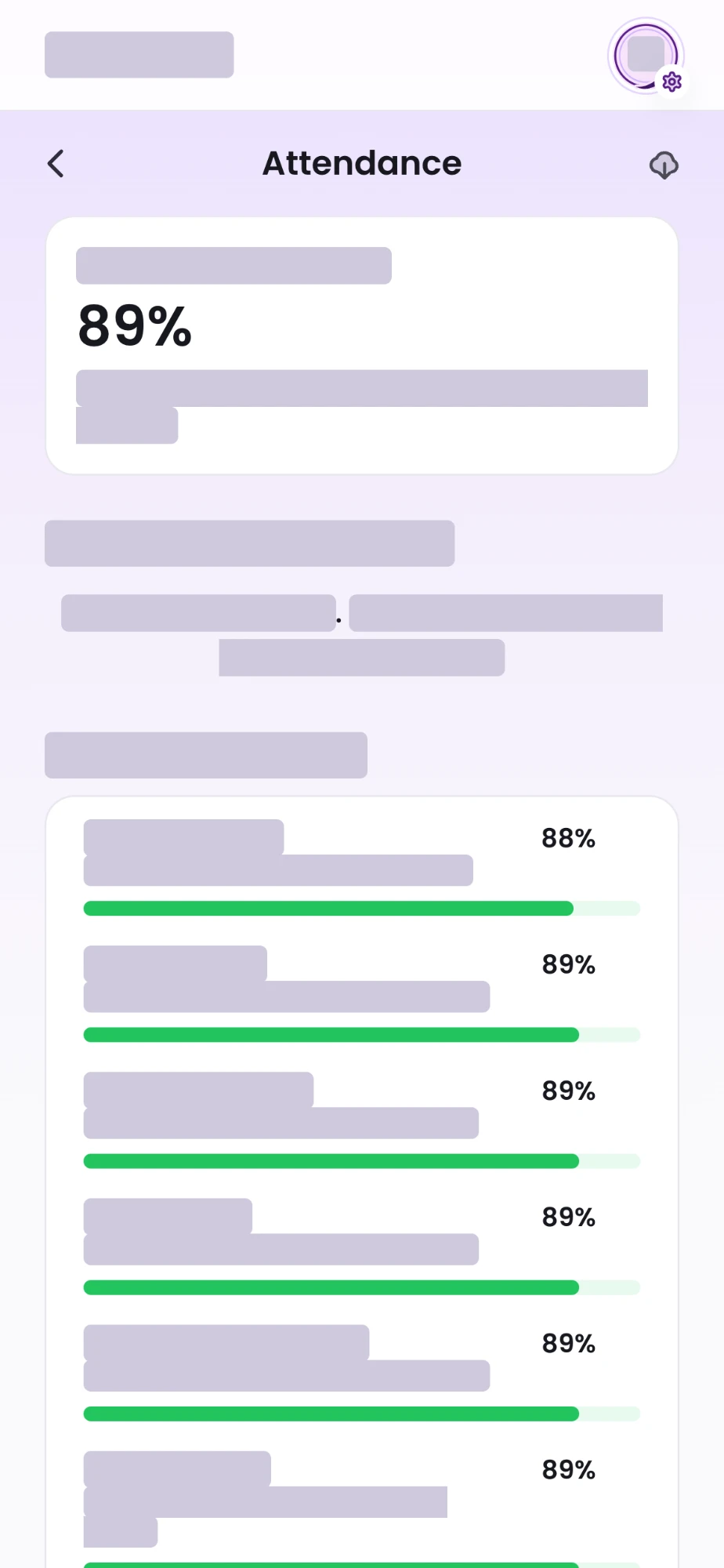
Attendance. One figure for the organisation, then every group underneath it, so a problem gets found rather than reported.
-
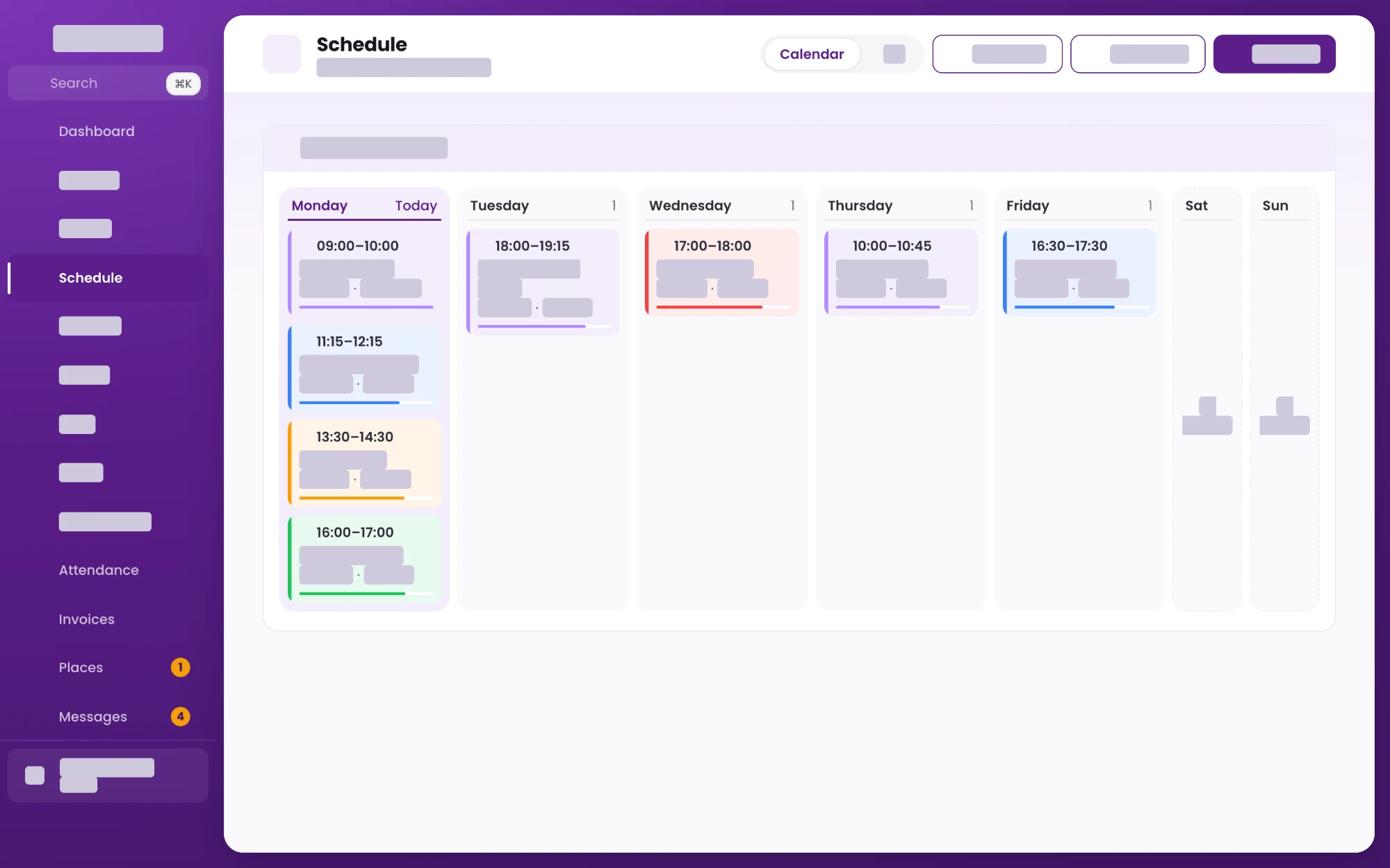
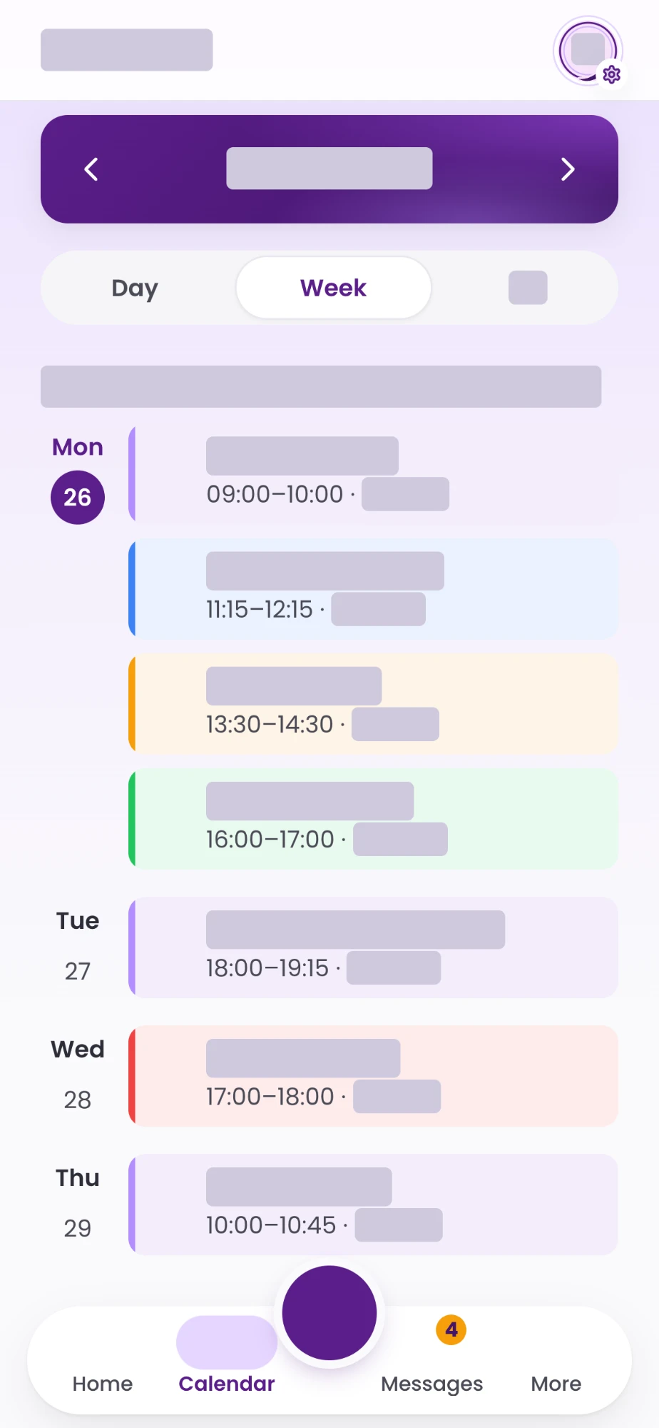
The week. Sessions are colour-coded by type and the current day is marked, because that is the question people arrive with.
-
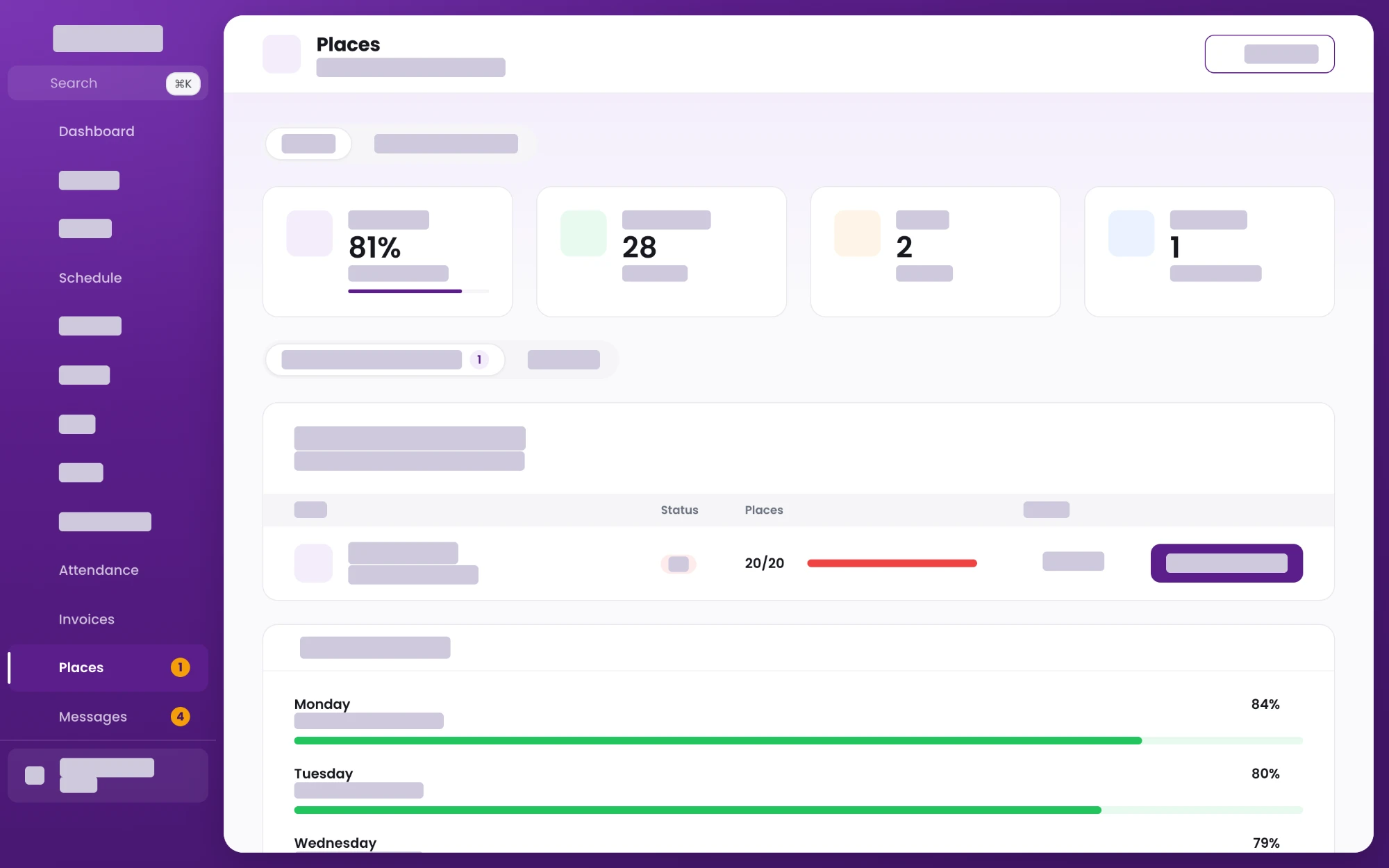
Capacity. A session at twenty of twenty places turns red, and the weekday breakdown underneath shows where the room actually is.
-
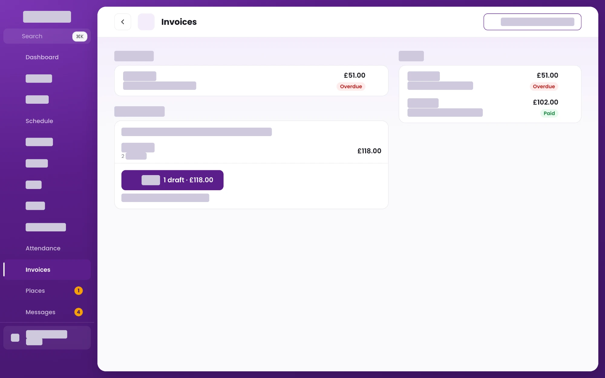
Billing. Drafts sit apart from what has been issued, so nothing goes out before somebody has looked at it.
-
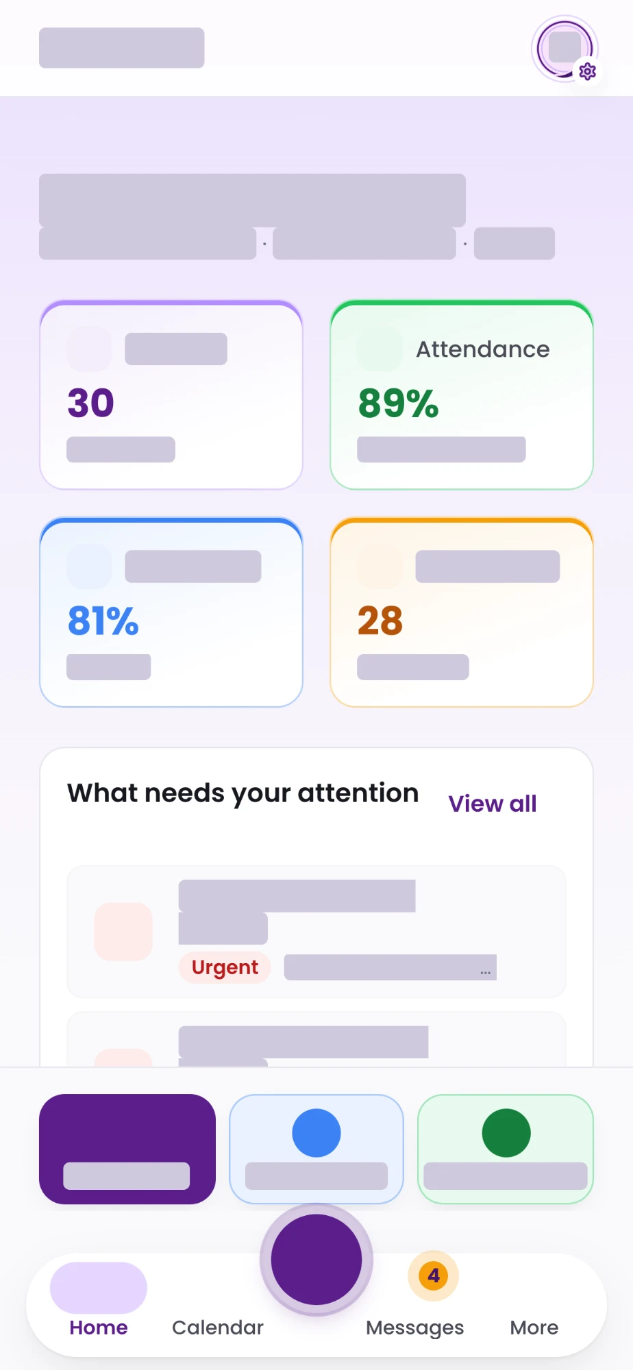
The same system on a phone. The same records, laid out for a thumb.
-
Smarter project planning.
- Type
- macOS application
- Runs on
- One Mac, entirely local
The problem
Project tools are built for teams reporting upwards, and they all have the same failure: keeping them accurate is work, so they stop being accurate, so nobody trusts the dates in them. The two questions that actually matter are what to do next and when this will be finished.
What we built
A Mac app holding projects, phases, milestones, decisions, blockers and logged work in a local database, which gives each project a completion range it can explain rather than a date it asserts. Built in Swift 6 on SQLite, across six modules and a test suite of seventy files.
There is no cloud service, no account and no API key. Everything stays on the machine it was written on.
The part that matters
It ships its own MCP server, so an AI assistant reads and writes the same records through the same validation the app uses. The plan stays current as a side effect of the work being done, rather than as a separate job somebody has to remember. It is the clearest example we have of building AI into something useful instead of bolting a chat box onto it.
Key features
- Native macOS application
- AI-assisted project planning
- Local-first architecture
- Intelligent forecasting
- Integrated knowledge management
Captured from the app running · navigation cropped to keep a client unnamed
-
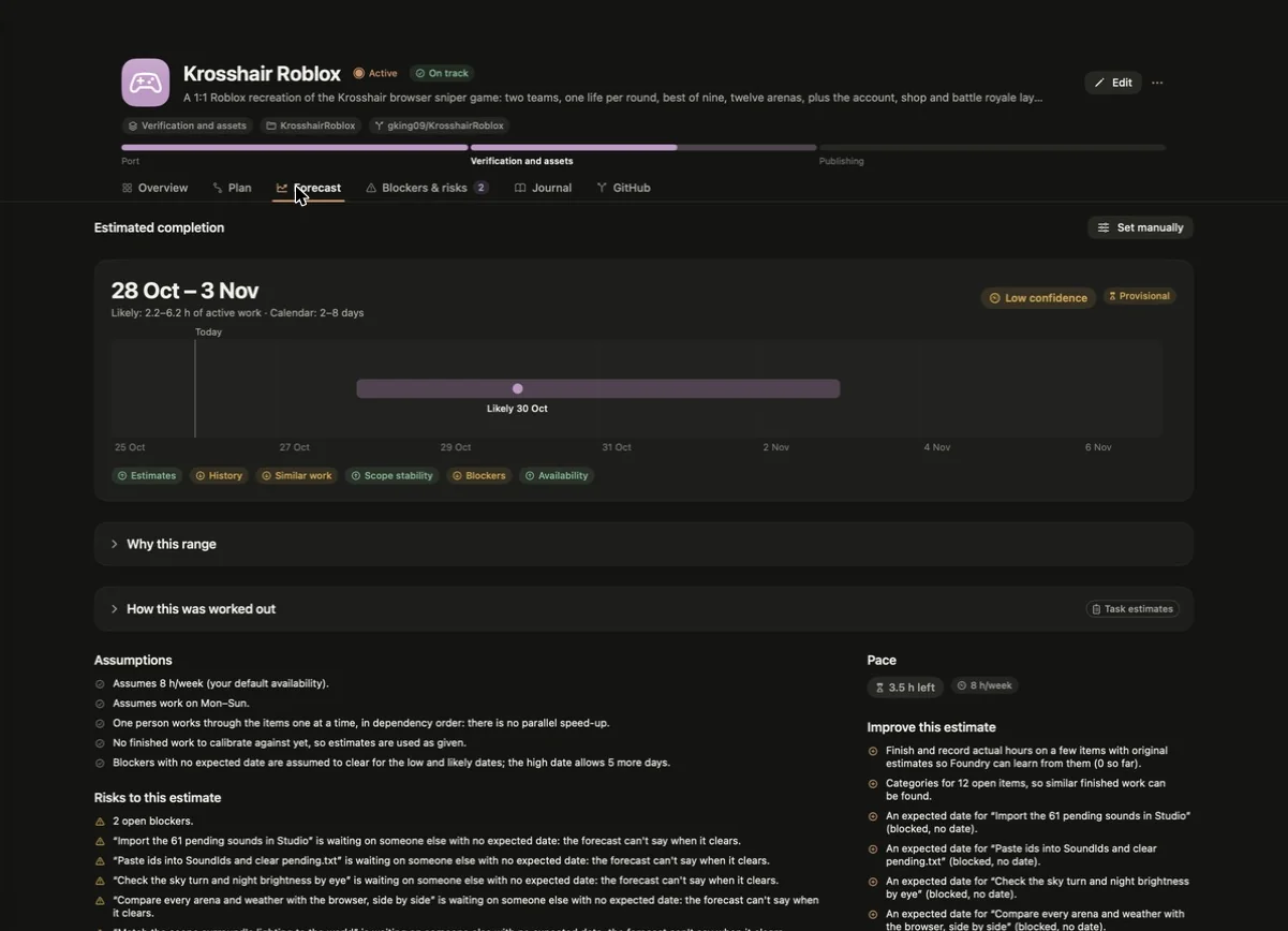
A range, not a date, with every assumption and risk behind it written out. The last column says what would make the estimate better, which is the only useful thing to do with an estimate you do not trust.
-
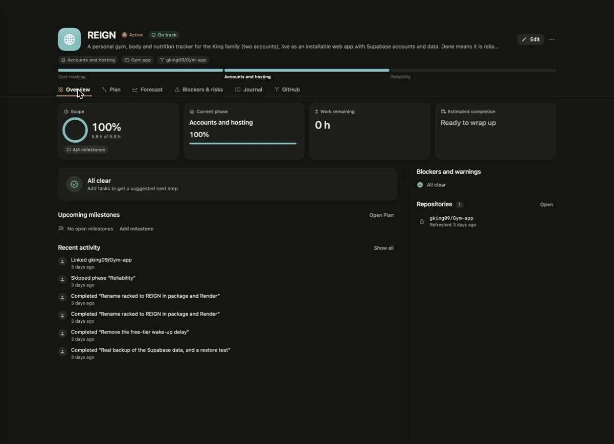
A project at a glance. Scope, phase, what is left, what is blocked and the repository it lives in, with the activity that produced those numbers underneath.
-
Helping students find opportunities.
- Type
- Student placement platform
- Runs on
- Web, iOS and Android
The problem
Finding a placement is long, mostly silent, and spread across job boards, email and whatever the school happens to use. Students lose track of where they are, and the people supervising them cannot see it either.
What we built
A CV builder, placement matching, company profiles, a revision planner, homework and an admin back office, with a dashboard that answers one question: what is the next thing worth doing. Sign-up is five short steps rather than one long form, because long forms get abandoned.
The iOS and Android apps wrap the same web app, so a change ships to all three at once.
Key features
- Placement marketplace
- Student dashboards
- CV builder
- Progress tracking
- Employer portal
- Administrative dashboard
- Mobile applications
Placely
-
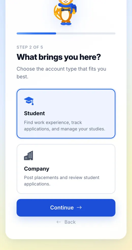
Signing up. Five short steps with a guide, rather than one long form that gets abandoned.
-
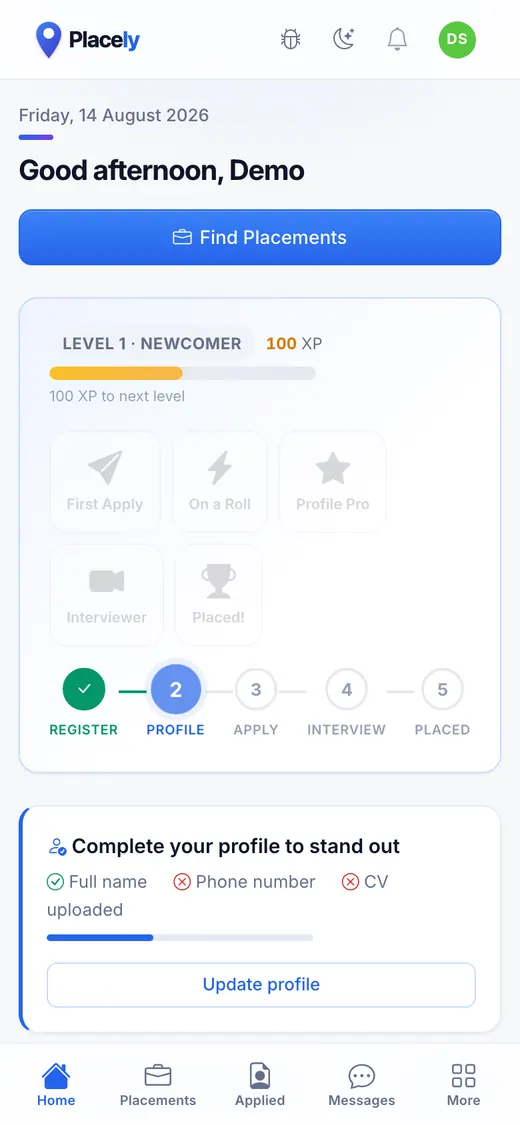
The dashboard. Where you are in the process, and the single next thing worth doing.
-
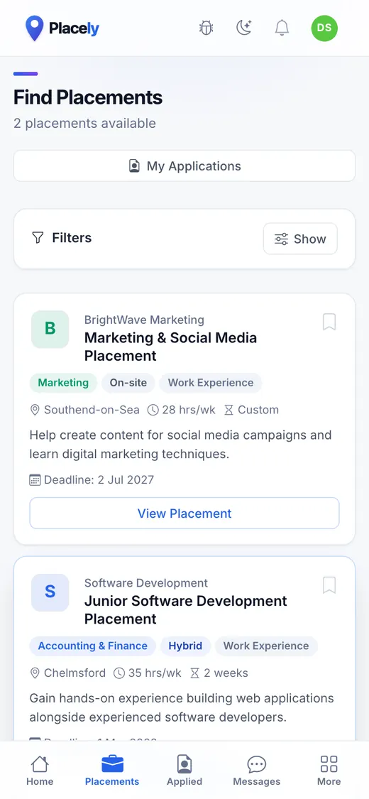
Finding a placement. Filterable listings with the details that decide it up front.
-
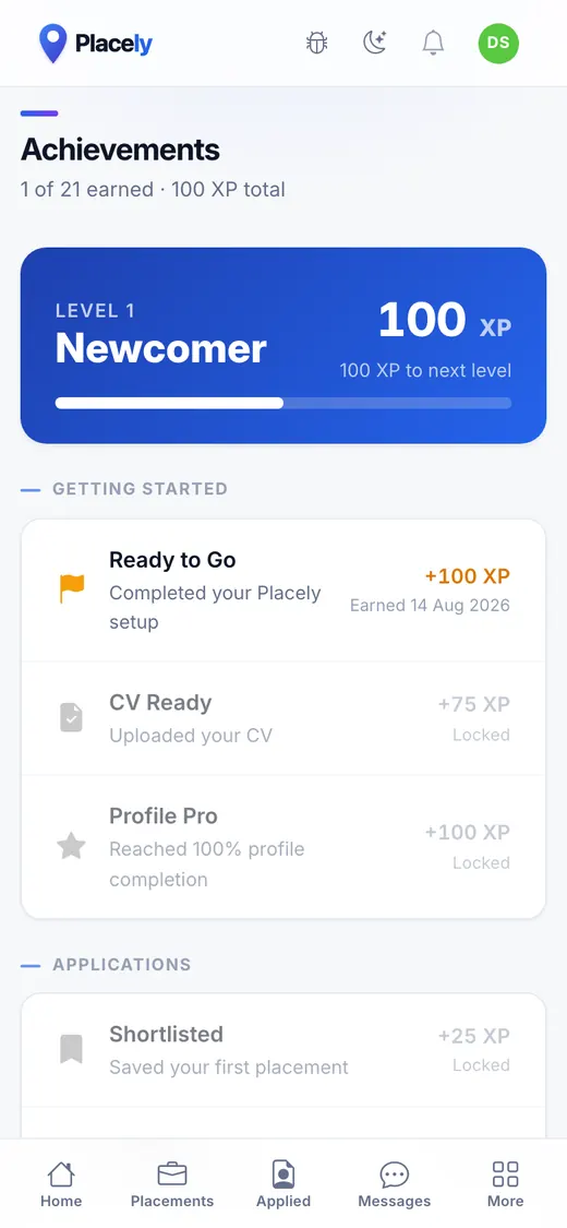
Achievements. Progress made visible, because a placement search is long and mostly silent.
-
Training without interruptions.
- Type
- Live web app
- Runs on
- Any phone, offline
The problem
A gym floor is an awkward place for software. The screen locks between sets, the signal drops in a basement, and nobody is going to retype a session they have already done.
What we built
Everything is written to the phone first and uploaded when the connection comes back, so a dropped signal loses nothing. The rest timer keeps sounding while the app is asleep, and the screen stays awake during a set.
Alongside the session log: a weekly plan, body tracking with trends, nutrition against targets, and a leaderboard, because turning up is the hard part.
How it holds up
The database decides who can see what, using security-definer functions rather than trusting the app, and 526 assertions across 17 files check that it does.
Key features
- Offline support
- Workout tracking
- Progress analytics
- Nutrition management
- Personal planning
- Performance insights
REIGN
-
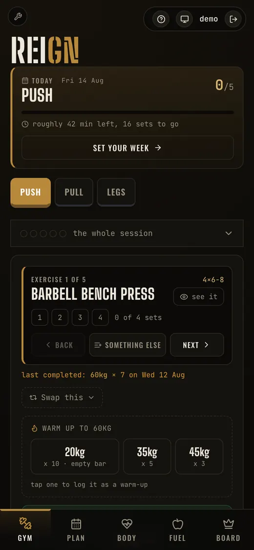
The session. Set counters, warm-up weights and the last thing you lifted, all on one screen.
-
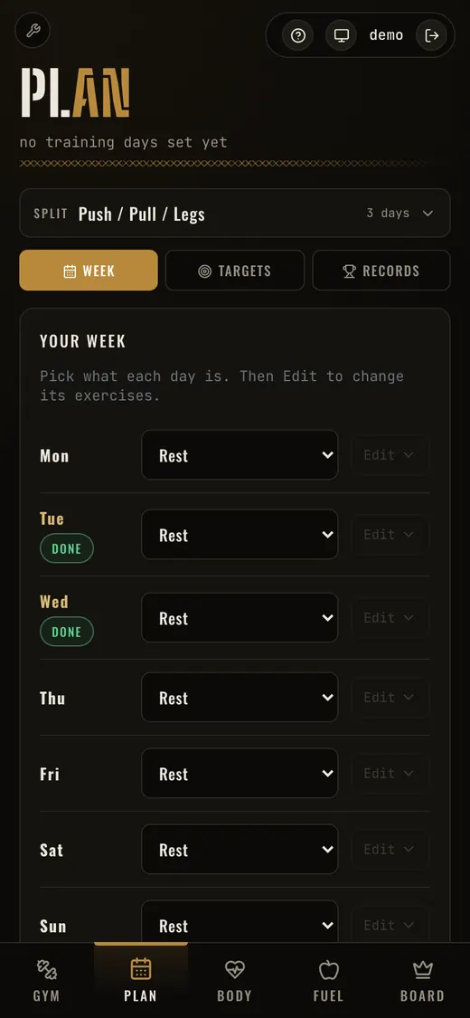
The week. Each day gets a session, and the exercises behind it are editable.
-
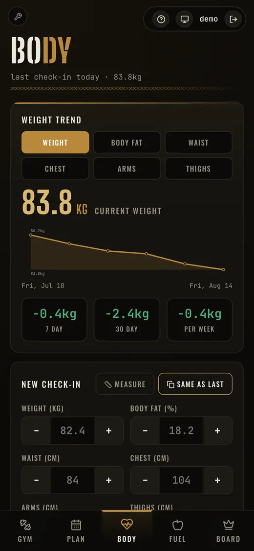
Body tracking. Trend chart, deltas over three windows, and a check-in that remembers last time.
-
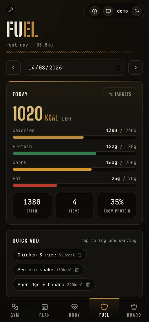
Nutrition. Macros against targets, and one tap to log a meal you eat every week.
-
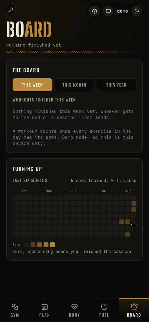
The board. A leaderboard between two people, and six months of turning up at a glance.
-
High-performance multiplayer.
- Type
- Multiplayer game
- Runs on
- The browser, and Roblox
- Status
- In development
The problem
One life per round, friends on different connections. If the server does not decide every hit, the player with the better connection wins, and everyone can feel it.
What we built
A round-based tactical shooter where one Node process serves the page and runs the match, owning every hit, health point and credit. Hit zones, damage falloff, armour and helmets, wall penetration that depends on the material, and lag rewind, so a shot is judged against what the shooter actually saw rather than where the target has since moved to.
Nothing is downloaded: every model, texture and sound is generated in code. Players sign in with Discord, or stay a guest with a callsign, and their progress follows them.
Then again, on Roblox
The same game rebuilt as a Roblox experience, sharing no servers or accounts but sharing every number: weapons, economy, round rules, twelve arenas, materials and lighting are exported from the browser game's own code, so the two play identically.
Captured from the game running
-
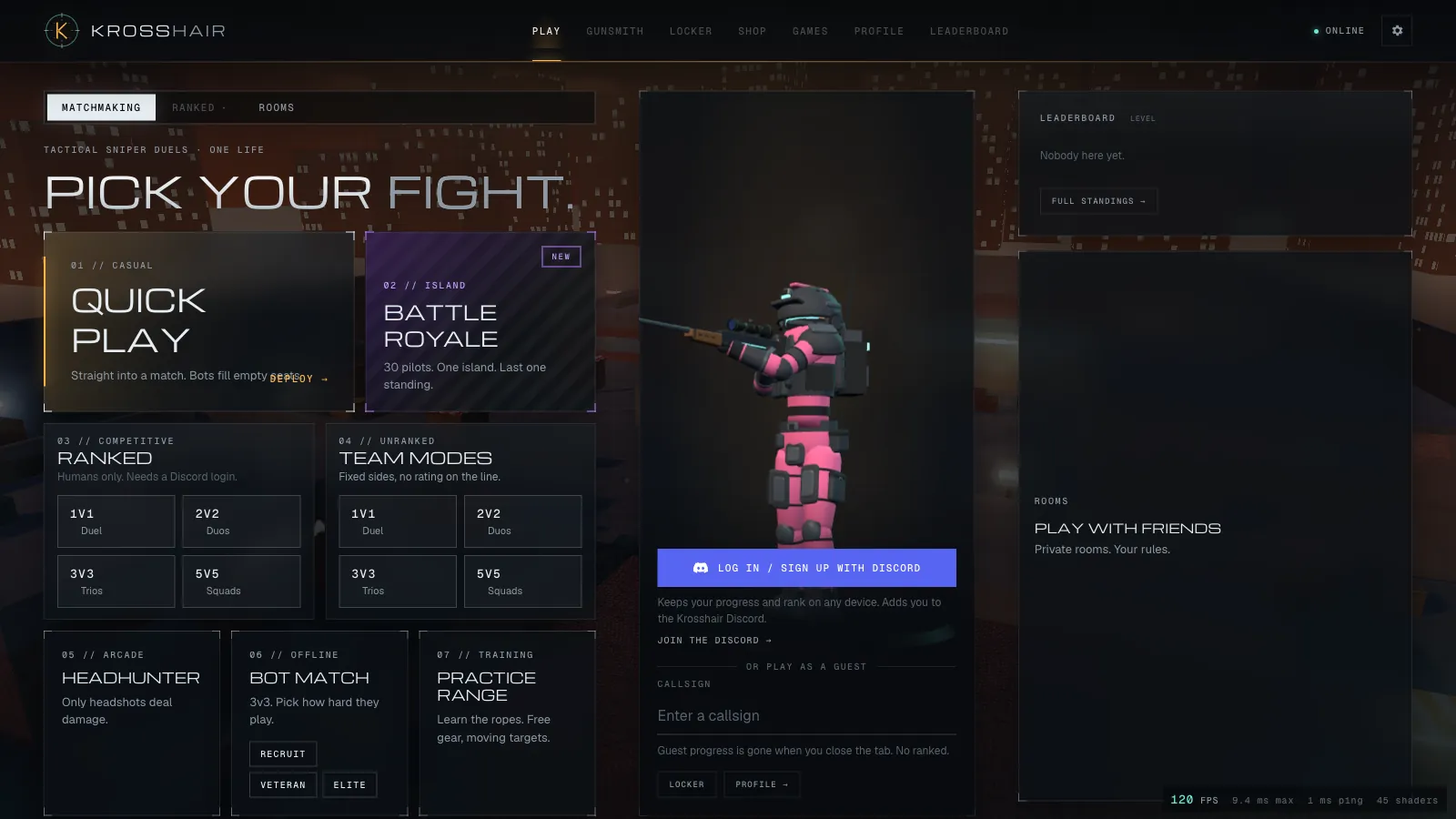
Seven modes, each explained in a line. Signing in is optional: a guest gets the game, an account gets to keep what they earn.
-
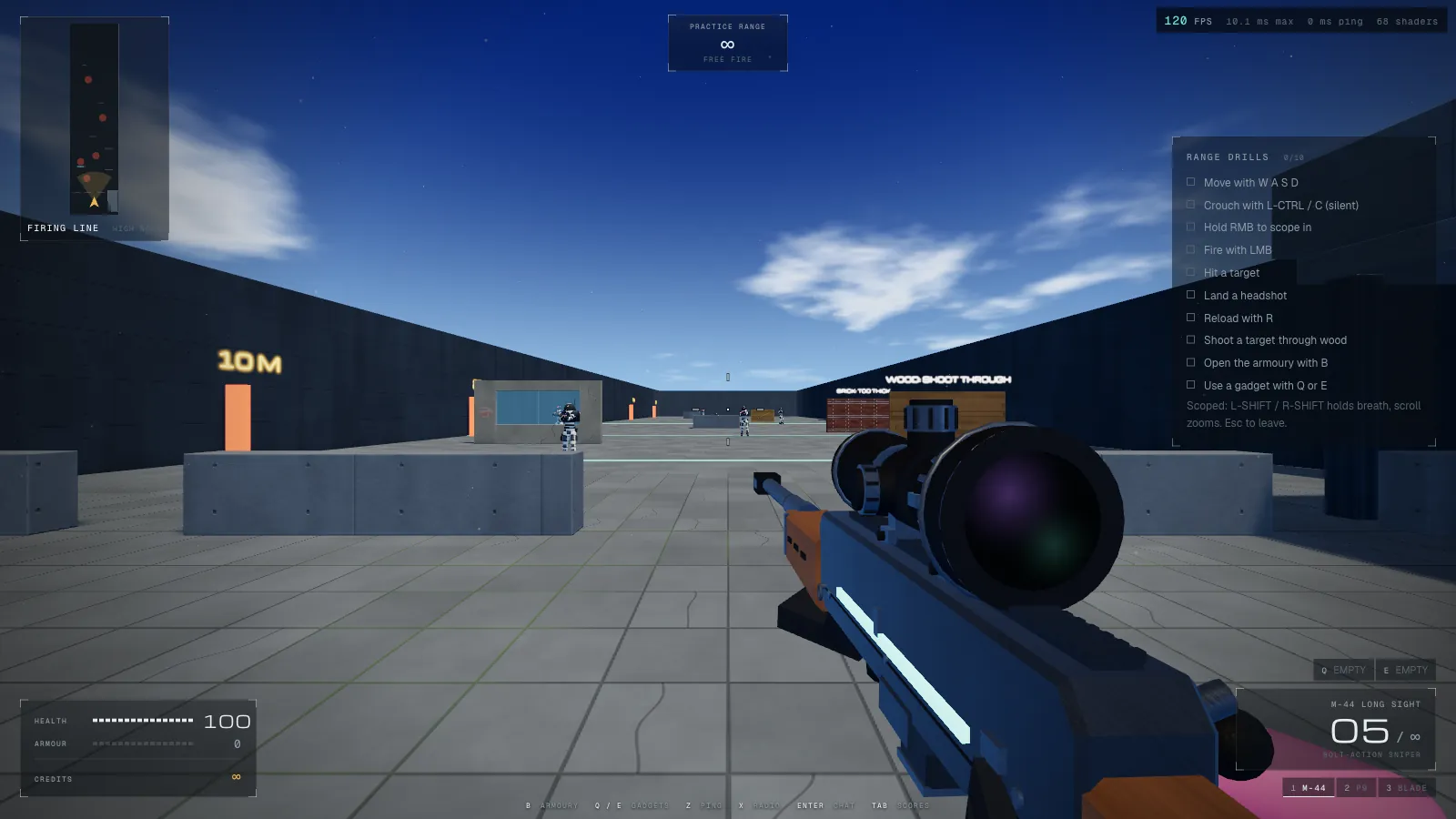
The practice range, where the drills teach the controls rather than a wall of text. The readout top right is the real frame time.
-
Reimagining an existing product.
- Type
- macOS application
- Built on
- An open-source notch app
The problem
An open-source app for the MacBook notch that was genuinely good had grown into an everything-app: a terminal, clipboard history, system stats, notes, a file shelf, an extension system. The useful parts were buried in the parts nobody wanted.
What we built
A fork cut back to a notch app and rebuilt around its own design language. Fifteen subsystems were removed one at a time, with the build and the tests kept green after each, which is the only way to take a large codebase apart without discovering a month later what depended on what.
Then the additions: a hub with a context-aware chip row, time-synced lyrics with an on-disk cache, timer and stopwatch live activities, battery detail down to charger wattage and cycle count, a tray for text and files, and background work gated on display sleep and Low Power Mode. Settings, the menu and onboarding were rebuilt from scratch.
Why it is here
Most software work is not a blank page. This is what it looks like to read, understand and reshape 285 files of somebody else's SwiftUI and AppKit, which is the same job as being handed a system nobody has touched for two years and asked to make it do something new.
-
Building trust through design.
- Type
- Website, live
- Runs on
- A static build
The problem
Water & Environmental Resource Management trace misconnected drainage for water companies, property by property. Most people arriving at their site are not buyers: they are householders who have just had a letter and want to understand who has contacted them and why.
What we built
A site that answers the householder's questions in order: why you were contacted, what a visit involves and how to confirm a caller is genuine, before anything about credentials.
It ships as a static build, so there is no CMS to patch and no server to keep secure, and it loads on a phone in a driveway.
WERM
-
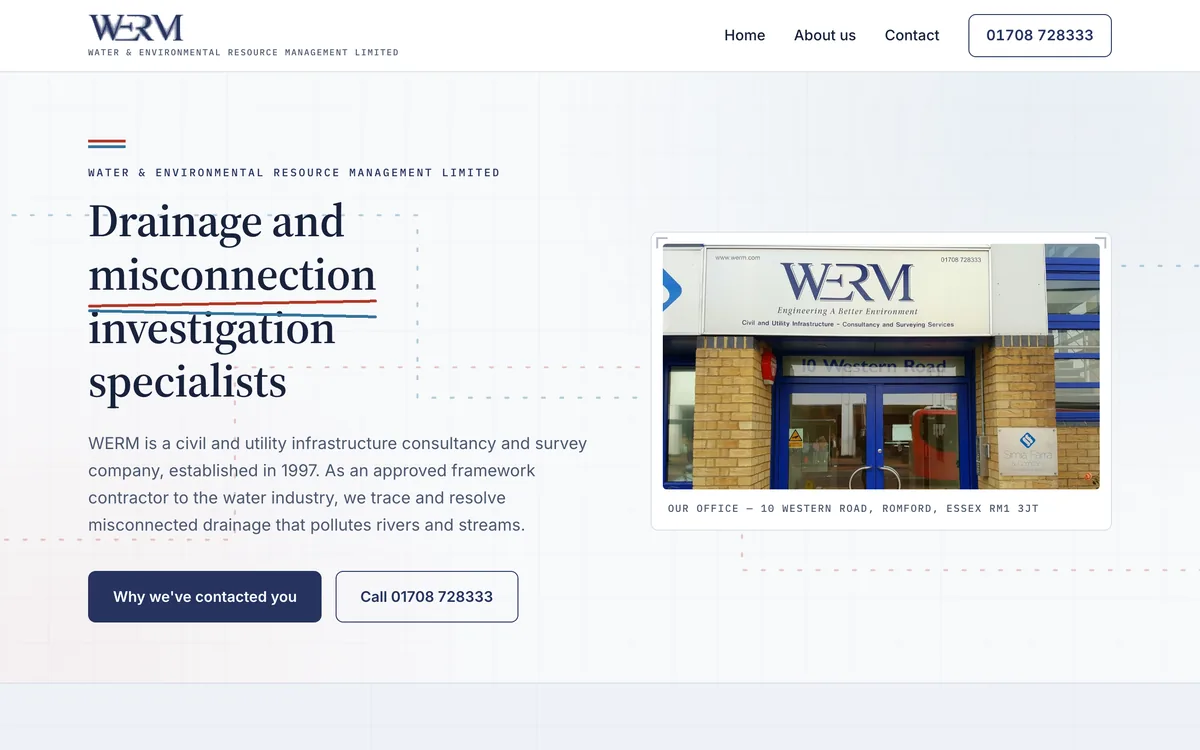
The home page. Who they are and why you might have heard from them, above the fold.
-
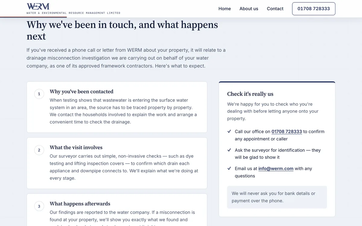
The reason most visitors arrive. Three numbered steps, and a panel on how to verify the caller before letting anyone in.
-
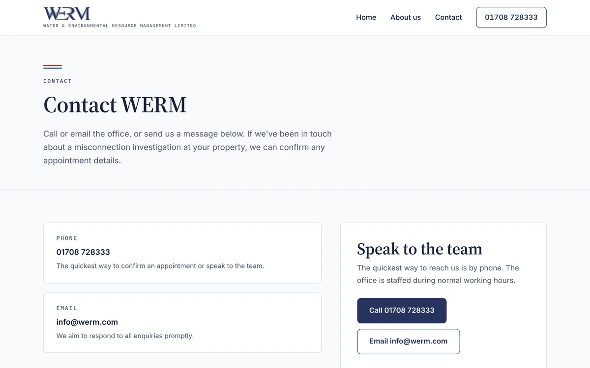
Contact. A phone number and an address, because that is what someone checking you are real wants.
-
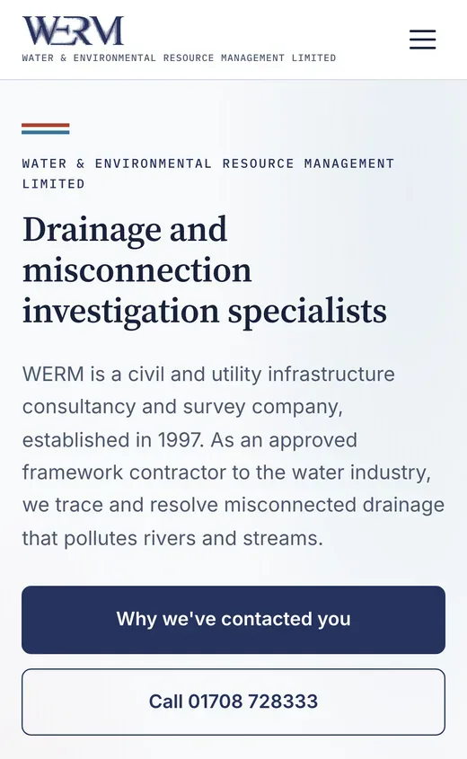
On a phone, where most of these visitors are reading it.
-
Digital tools for teams in the field.
- Type
- Field and office application
- Runs on
- A phone on site, a desktop in the office
- Status
- In development
The problem
Every job starts with a risk assessment and every van needs a monthly equipment check. On a street in the rain, with the pad in the cab, those get done from memory and written up later, which is exactly when the detail goes missing. The forms are not optional: they are the code of practice.
What we are building
A phone app for the people doing the work and a desktop back office for the people who need the records. A risk assessment is ten questions and a timed vehicle count, and it comes out as the company's own signed form rather than a new format somebody has to accept.
The monthly van check is fifty-one items across six compartments, done by swiping. Anything worn, damaged or missing is flagged with a count and a spoken note, and the flag follows the van rather than sitting in a photo on somebody's phone.
The detail that matters
The traffic control options carry the page numbers of the code of practice they come from, and the vehicle count enforces the limits that code sets, counting down three minutes while you tally cars and HGVs. The rules live in the software rather than in somebody's memory, which is the whole reason to build the thing rather than print the form again.
Where it has got to
In development, with four roles to sign in as so the client can try it as an operative, a team leader, an H&S coordinator and the office. Working with no signal and uploading to the office are specified and not built yet, and the app says so in its own settings instead of pretending otherwise.
In development, captured from the running app
-
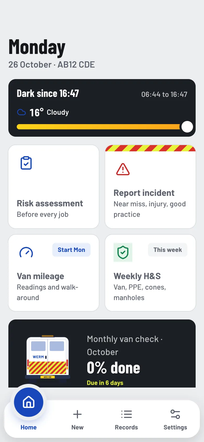
The day, and the four things that might need doing in it. Light and weather are there because works after dark need a different conversation.
-
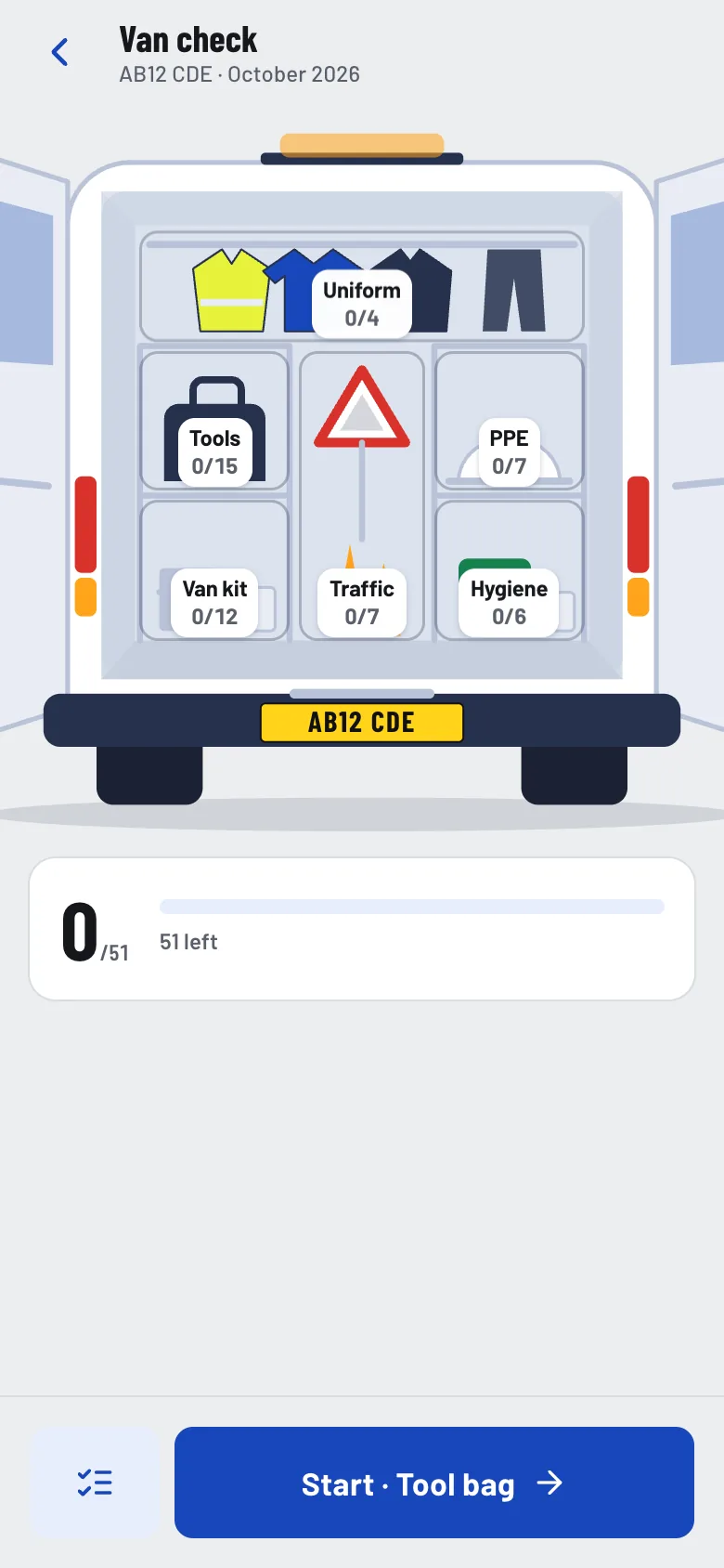
Fifty-one items, drawn as the van they are actually in, so you check the compartment in front of you rather than hunting down a list.
-
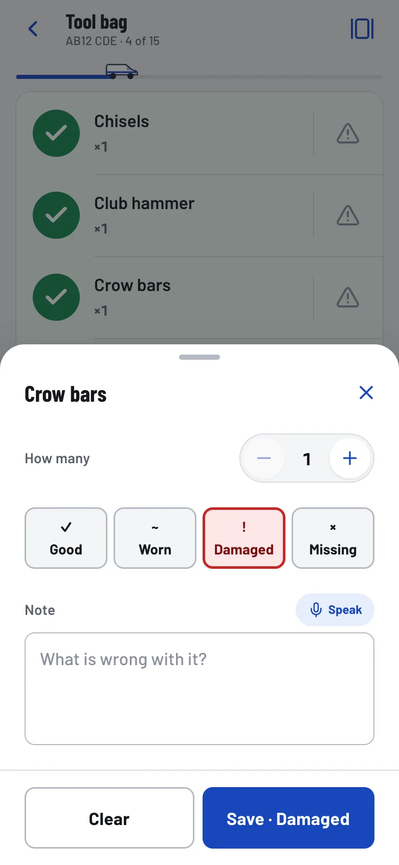
Flagging something takes one tap and a spoken note. Typing on a phone in gloves is why paper checks get ticked without looking.
-
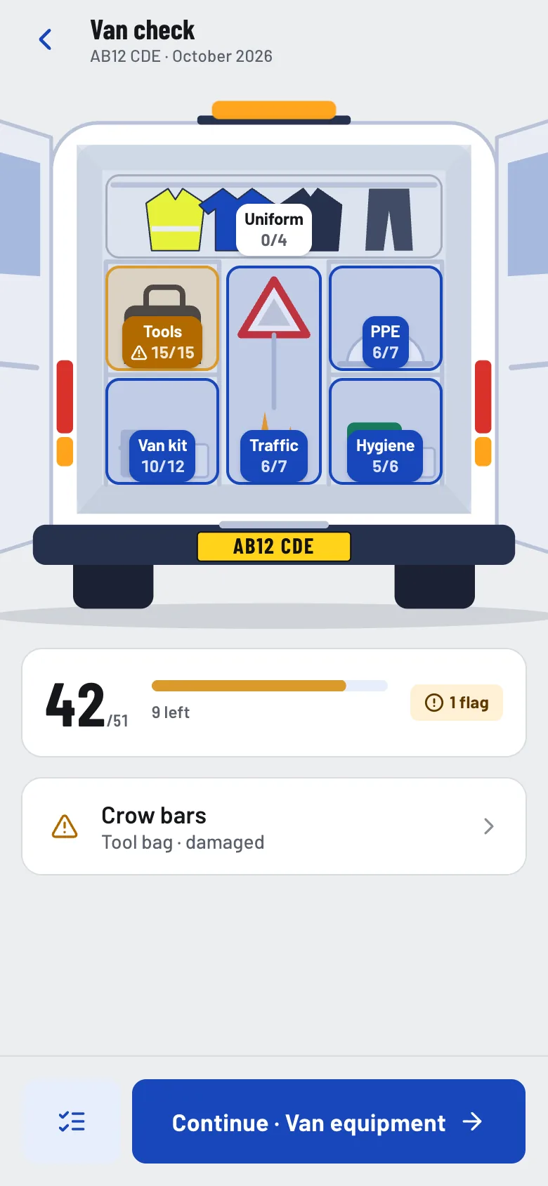
Progress by compartment, and the flag carried to the top. The check is resumable, because it is rarely done in one go.
-
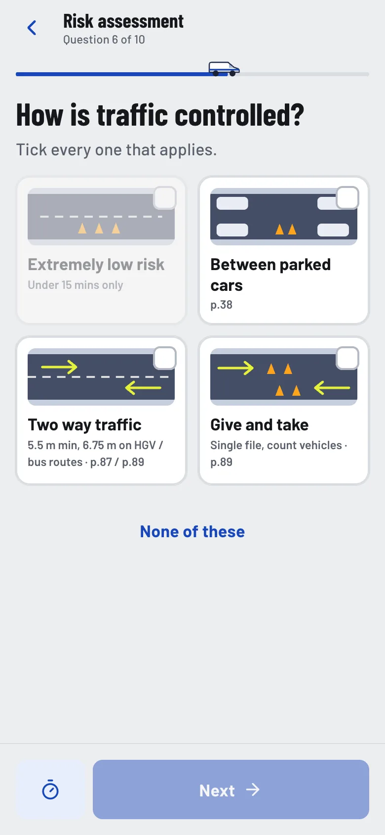
Each option is drawn and carries the page of the code of practice it comes from. The knowledge is in the app, not in the person.
-
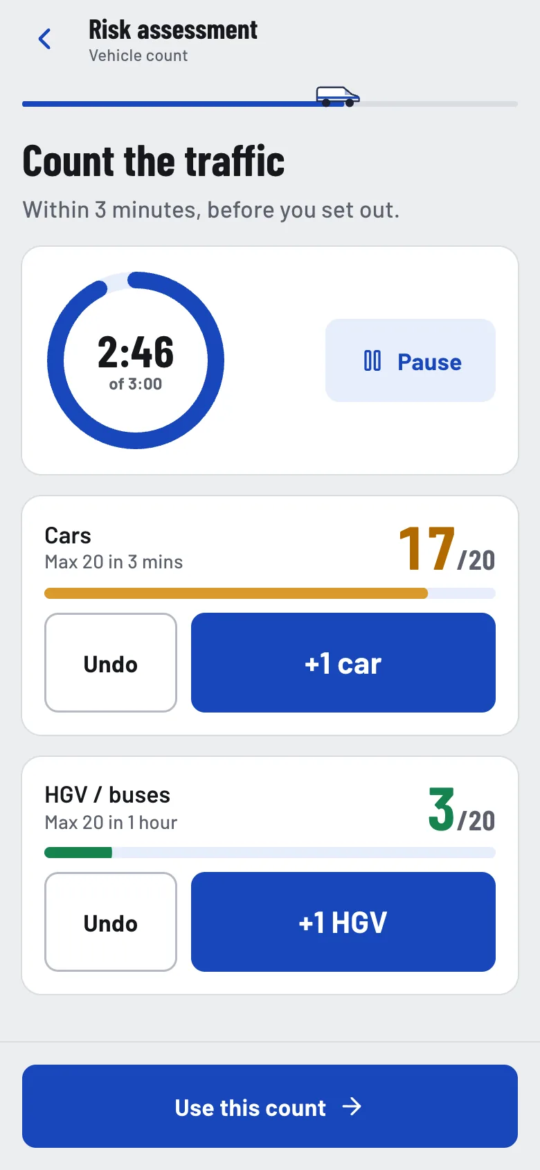
The count the code requires, timed, with its limits enforced as you tally. Go over and the method is no longer allowed.
-
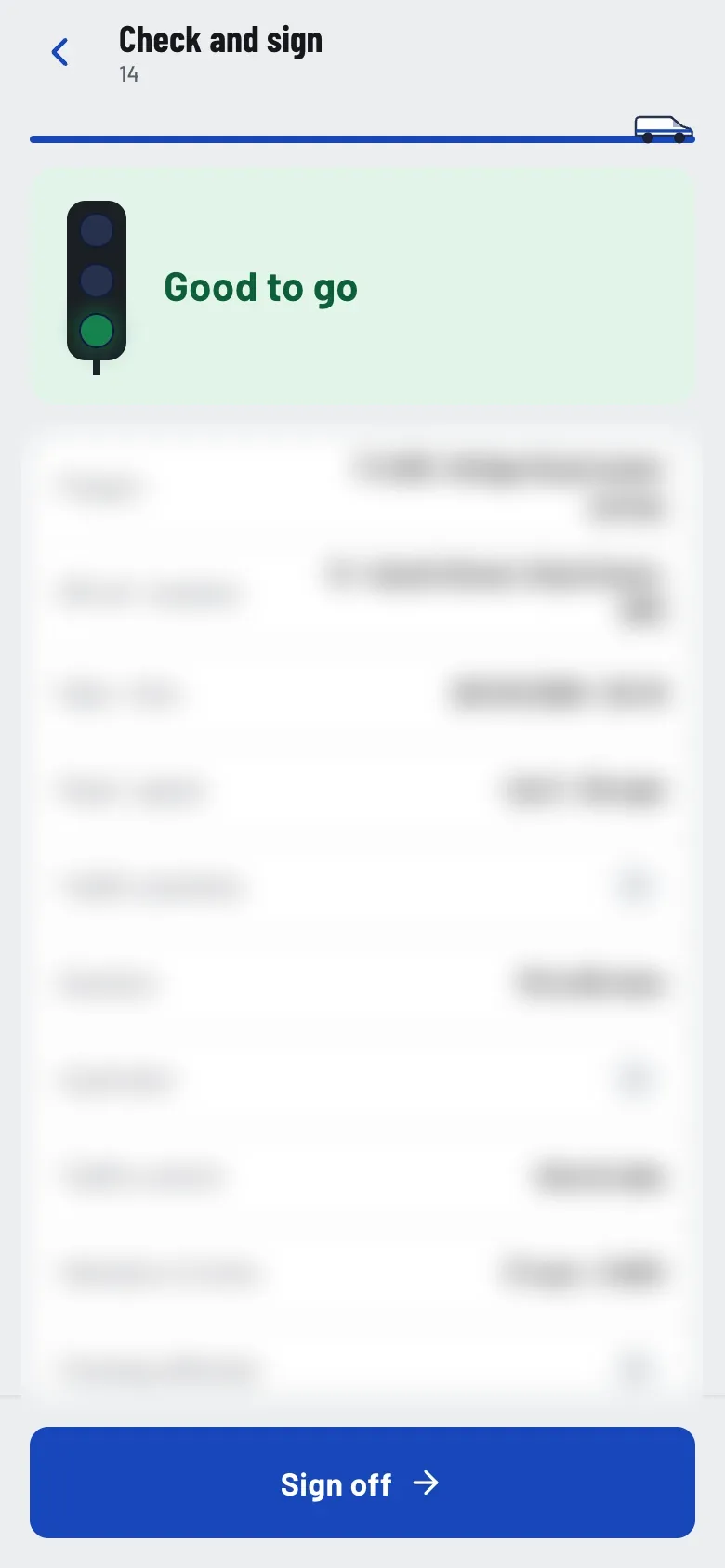
Everything answered, read back in one screen, with a plain verdict at the top before anybody signs.
-
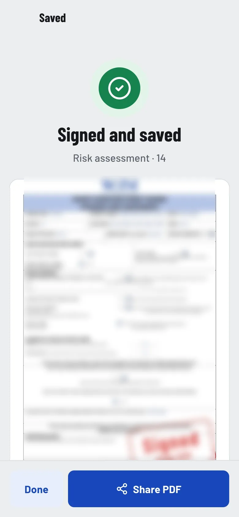
Out comes the company's own form, filled in and signed. Nobody has to accept a new document, and the audit trail is the one they already keep.
-
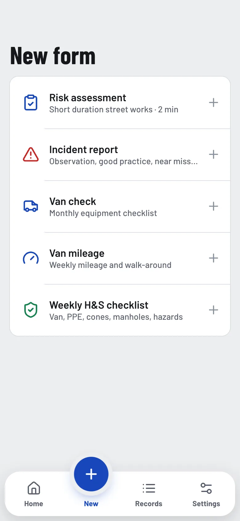
The five forms the work actually generates, each the paper version shortened to what a phone can ask.
Why clients choose us
The same studio does the thinking and the building.
Design and engineering are not handed between two companies here, so what gets drawn is what gets built, and the detail survives the journey from the first sketch to the thing people use every day.
- Design and engineering together. One studio holds both, so nothing is lost in translation.
- Built around the business. The software follows how the work already happens, rather than the other way round.
- Designed, not assembled. Every screen is designed, not assembled from a template.
- Projects of every size. From a single website to an entire operation on one platform.
- Still here afterwards. Software is looked after once it is live, not handed over and forgotten.
Let’s build your next project.
Tell us what you need and we will tell you how we would build it.